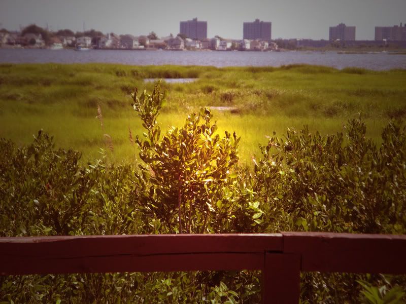
Jamaica Wildlife Preserve July 2008
I played with the color so it came out what I call "more than sepia." And lit the photo there in the middle for effect.
See other Creative Photography Contest participants here
I played with the color so it came out what I call "more than sepia." And lit the photo there in the middle for effect.
See other Creative Photography Contest participants here
theteach

24 comments:
Very nice. I feel as though I am sitting behind the red rail (?) and peering right through the lens with you. Love what you did with the picture.
I am trying to upload Ruby Tuesday photos and blogger picture loading is broken. The help boards are full of complaints. Thought you might want to know.
Argh.
The little light looks like a flashlight presenting the rest of the picture. And the rail provides a stage to what's beyond. Or is what's beyond the stage and we are the audience?
I thought there wasn't going to be a creative photography this week. I have something ready so I guess I'll play too. I like this what you did with the light on this too.
Oh - and I love your new banner photo. Beautiful.
Wow ! that looks beautiful ! like gold !
Pretty! I think that the way you fixed the color gave this photo a sort of retro feel. Very cool.
Intersting. I like it.
The lighting is so cool.
Interesting effects there Mary...nicely done. good luck
you must have a very expensive camera, and i do know you have good taste in the pictures you take
When did you go to Jamaica?
:)
Like Askew to You, I thought this had an older photo feel to it. And I love the lit effect in the center.
This is an interesting "more than sepia" photo.
I love the light in the center of it.
I love the gold effect on the photo, very creative!
I love the effect Mary.
An urban refuge - in the city but seemingly another world, a salt water oasis...
Every I see "teach" and college professor, it reminds me when my daughter was a GA and had to teach an intro psychology course. What stories she had...
Love the photo technique
Love the red wall, I have one red wall in my house.
I have a colorful bird for Ruby Tuesday.
I love the golden glow in the picture. It gives it a soul!
I digg how you put the light in the center. Very creative.
Good Luck!
Pkayfit
http://physiquealicious.com
Mary, very nice edits done to this picture. Looks almost as if there's a torch light shining down or maybe aliens arriving from a space craft! :P
your effects make it seem 3D. it also reminded me of the exhibits at the Museum of Natural History - that's how good the lighting is!
I could not muster a CP entry this week but the fun is in visiting anyway.
Beautiful post-work on that one. Thanks for your Creative Photography submission! :)
NICE!!!!!!!!!!!!
Good luck!
:-Daryl
Makes me think of "Godlight"... when a ray of sunshine comes down on one spot as if too tell you to pay close attention.
Beautiful effect!
Reminds me of "Fields of Gold" by Sting.
"... and we walked in fields of gold..."
Post a Comment